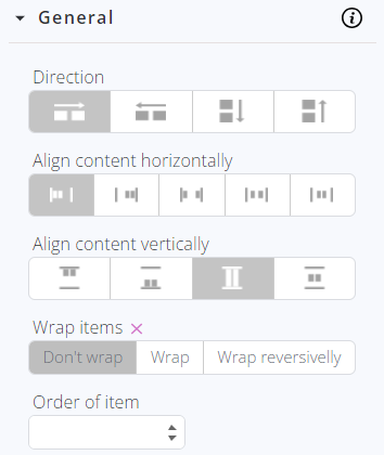
The General sub-tab becomes accessible for editing exclusively when the CSS property "Display" is configured to use the "Flex" option within the Extra tab. A flex container dynamically adjusts its items to utilize available space efficiently or prevent overflow.
It provides control over:
- Direction
- Horizontal alignment
- Vertical alignment
The “Wrap items” CSS property sets whether flex items are forced onto one line or can wrap onto multiple lines. If wrapping is allowed, it sets the direction in which the lines are stacked.
Values:
-
nowrap: the flex items are laid out in a single line which may cause the flex container to overflow. The cross-start is either equivalent to the start or before depending on the flex-direction value. This is the default value.
-
wrap: the flex items break into multiple lines. The cross-start is either equivalent to the start or before depending flex-direction value and the cross-end is the opposite of the specified cross-start.
-
wrap-reverse: behaves the same as wrap but cross-start and cross-end are permuted.
The “Order of items” CSS property sets the order to lay out an item in a flex or grid container. Items in a container are sorted by ascending order value and then by their source code order.
The value is set via the integers which represent the ordinal group to be used by the item.