The Extra tab contains the CSS controls which help to adjust HTML properties for the elements in the template.
Position
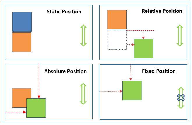
The position property specifies the type of positioning method used for an element (static, relative, absolute, fixed, or sticky).
static |
Default value. Elements render in order, as they appear in the document flow |
absolute |
The element is positioned relative to its first positioned (not static) ancestor element |
fixed |
The element is positioned relative to the browser window |
relative |
The element is positioned relative to its normal position, so "left:20px" adds 20 pixels to the element's LEFT position |
To check how this property works, visit the link or video tutorial.
In Composer Online, the Position property can be adjusted in Printable and Microsite templates only.
Top
The top CSS property participates in specifying the vertical position of a positioned element. It has no effect on non-positioned elements.
The effect of the top depends on how the element is positioned (i.e., the value of the position property):
- When a position is set to absolute or fixed, the top property specifies the distance between the element's outer margin of the top edge and the inner border of the top edge of its containing block.
- When position is set to relative, the top property specifies the distance the element's top edge is moved below its normal position.
- When a position is set to sticky, the top property is used to compute the sticky-constraint rectangle.
- When a position is set to static, the top property has no effect.
When both top and bottom are specified, the position is set to absolute or fixed, and height is unspecified (either auto or 100%) both the top and bottom distances are respected. In all other situations, if height is constrained in any way or position is set to relative, the top property takes precedence and the bottom property is ignored.
Right
The right CSS property participates in specifying the horizontal position of a positioned element. A positioned element is an element whose computed position value is either relative, absolute, fixed, or sticky (in other words, it's anything except static). It has no effect on non-positioned elements.
The effect of right depends on how the element is positioned (i.e., the value of the position property):
- When a position is set to absolute or fixed, the right property specifies the distance between the element's outer margin of the right edge and the inner border of the right edge of its containing block.
- When a position is set to relative, the right property specifies the distance the element's right edge is moved to the left from its normal position.
- When a position is set to sticky, the right property is used to compute the sticky-constraint rectangle.
- When a position is set to static, the right property has no effect.
When both left and right are defined, if not prevented from doing so by other properties, the element will stretch to satisfy both. If the element cannot stretch to satisfy both — for example, if a width is declared — the position of the element is over-constrained. When this is the case, the left value has precedence when the container is left-to-right; the right value has precedence when the container is right-to-left.
Try the property via the link.
Left
The left CSS property participates in specifying the horizontal position of a positioned element. A positioned element is an element whose computed position value is either relative, absolute, fixed, or sticky (in other words, it's anything except static). It has no effect on non-positioned elements.
The effect of left depends on how the element is positioned (i.e., the value of the position property):
- When a position is set to absolute or fixed, the left property specifies the distance between the element's outer margin of the left edge and the inner border of the left edge of its containing block. (The containing block is the ancestor to which the element is relatively positioned.)
- When a position is set to relative, the left property specifies the distance the element's left edge is moved to the right from its normal position.
- When a position is set to sticky, the left property is used to compute the sticky-constraint rectangle.
- When a position is set to static, the left property has no effect.
When both left and right are defined, and width constraints don't prevent it, the element will stretch to satisfy both. If the element cannot stretch to satisfy both, the position of the element is overspecified. When this is the case, the left value has precedence when the container is left-to-right; the right value has precedence when the container is right-to-left.
Try the property via the link.
Bottom
The bottom CSS property participates in setting the vertical position of a positioned element. A positioned element is an element whose computed position value is either relative, absolute, fixed, or sticky (in other words, it's anything except static). It has no effect on non-positioned elements.
The effect of the bottom depends on how the element is positioned (i.e., the value of the position property):
- When a position is set to absolute or fixed, the bottom property specifies the distance between the element's outer margin of the bottom edge and the inner border of the bottom edge of its containing block.
- When position is set to relative, the bottom property specifies the distance the element's bottom edge is moved above its normal position.
- When a position is set to sticky, the bottom property is used to compute the sticky-constraint rectangle.
- When a position is set to static, the bottom property has no effect.
When both the top and bottom are specified, the position is set to absolute or fixed, and height is unspecified (either auto or 100%) both the top and bottom distances are respected. In all other situations, if height is constrained in any way or position is set to relative, the top property takes precedence and the bottom property is ignored.
Try the property via the link.
Table-layout
The table-layout CSS property sets the algorithm used to lay out <table> cells, rows, and columns. There are 2 values: auto and fixed.
Auto: by default, most browsers use an automatic table layout algorithm. The widths of the table and its cells are adjusted to fit the content.
Fixed: table and column widths are set by the widths of table and col elements or by the width of the first row of cells. Cells in subsequent rows do not affect column widths.
Under the "fixed" layout method, the entire table can be rendered once the first table row has been downloaded and analyzed. This can speed up rendering time over the "automatic" layout method, but subsequent cell content might not fit in the column widths provided. Cells use the overflow property to determine whether to clip any overflowing content, but only if the table has a known width; otherwise, they won't overflow the cells.
Try the property via the link.
Word-break
The word-break CSS property sets whether line breaks appear wherever the text would otherwise overflow its content box. There are 4 options: normal, break-all, keep-all, break-word
normal |
Use the default line break rule. |
break-all |
To prevent overflow, word breaks should be inserted between any two characters (excluding Chinese/Japanese/Korean text). |
keep-all |
Word breaks should not be used for Chinese/Japanese/Korean (CJK) text. Non-CJK text behavior is the same as normal. |
break-word |
Has the same effect as word-break: normal and overflow-wrap: anywhere, regardless of the actual value of the overflow-wrap property. |
Try the property via the link.
Display
The display CSS property sets whether an element is treated as a block or inline box and the layout used for its children, such as flow layout, grid, or flex. Formally, the display property sets an element's inner and outer display types.
inline |
Displays an element as an inline element (like <span>). Any height and width properties will have no effect |
block |
Displays an element as a block element (like <p>). It starts on a new line and takes up the whole width |
contents |
Makes the container disappear, making the child elements children of the element the next level up in the DOM |
flex |
Displays an element as a block-level flex container |
grid |
Displays an element as a block-level grid container |
inline-block |
Displays an element as an inline-level block container. The element itself is formatted as an inline element, but you can apply height and width values |
Try the property via the link.
Object-fit
The object-fit CSS property sets how the content of a replaced element, such as an <img> or <video>, should be resized to fit its container.
contain |
The replaced content is scaled to maintain its aspect ratio while fitting within the element's content box. The entire object is made to fill the box while preserving its aspect ratio, so the object will be "letterboxed" if its aspect ratio does not match the aspect ratio of the box. |
cover |
The replaced content is sized to maintain its aspect ratio while filling the element's entire content box. If the object's aspect ratio does not match the aspect ratio of its box, then the object will be clipped to fit. |
fill |
The replaced content is sized to fill the element's content box. The entire object will completely fill the box. If the object's aspect ratio does not match the aspect ratio of its box, then the object will be stretched to fit. |
none |
The replaced content is not resized. |
scale-down |
The content is sized as if none or contain were specified, whichever would result in a smaller concrete object size. |
Try the property via the link.
Page-break inside
The page-break-inside CSS property adjusts page breaks inside the current element. There are 2 values:
-
Auto: Initial value. Automatic page breaks (neither forced nor forbidden).
-
Avoid: Avoid page breaks inside the element.
Try the property via the link.
Page-break After
The page-break-after CSS property adjusts page breaks after the current element.
always |
Always force page breaks after the element. |
avoid |
Avoid page breaks after the element. |
left |
Force page breaks after the element so that the next page is formatted as a left page. It's the page placed on the left side of the spine of the book or the back side of the page in duplex printing. |
right |
Force page breaks after the element so that the next page is formatted as the right page. It's the page placed on the right side of the spine of the book or the front side of the page in duplex printing. |
Inherit |
Inherit the behavior of the parent element. |
Try the property via the link.
Page-break Before
The page-break-before CSS property adjusts page breaks before the current element.
This property applies to block elements that generate a box. It won't apply on an empty <div> that won't generate a box.
It has the same values as a page-break-before.
Try the property via the link.
Border-collapse
The border-collapse CSS property sets whether cells inside a <table> have shared or separate borders.
When cells collapse, the border-style value of the inset behaves like a groove, and the outset behaves like a ridge.
When cells are separated, the distance between cells is defined by the border-spacing property.
separate |
Borders are separated; each cell will display its own borders. This is the default. |
collapse |
Borders are collapsed into a single border when possible (border-spacing and empty-cells properties have no effect) |
initial |
Sets this property to its default value. Read about initial |
inherit |
Inherits this property from its parent element. Read about inherit |
revert |
Reset the style. |
unset |
No styling is set. |
Try the property via the link.
Vertical align
The vertical-align CSS property sets the vertical alignment of an inline, inline-block, or table-cell box.
The vertical-align property can be used in two contexts:
- To vertically align an inline-level element's box inside its containing line box. For example, it could be used to vertically position an image in a line of text.
- To vertically align the content of a cell in a table.
 Note that vertical alignment only applies to inline, inline-block, and table-cell elements: you can't use it to vertically align block-level elements.
These values vertically align the element relative to its parent element:
baseline |
Aligns the baseline of the element with the baseline of its parent. The baseline of some replaced elements, like <textarea>, is not specified by the HTML specification, meaning that their behavior with this keyword may vary between browsers. |
sub |
Aligns the baseline of the element with the subscript baseline of its parent. |
super |
Aligns the baseline of the element with the superscript baseline of its parent. |
text-top |
Aligns the top of the element with the top of the parent element's font. |
text-bottom |
Aligns the bottom of the element with the bottom of the parent element's font. |
middle |
Aligns the middle of the element with the baseline plus half the x-height of the parent. |
Try the property via the link.
Z-index
The z-index CSS property sets the z-order of a positioned element and its descendants or flex items. Overlapping elements with a larger z-index cover those with a smaller one.
For a positioned box (that is, one with any position other than static), the z-index property specifies:
- The stack level of the box in the current stacking context.
- Whether the box establishes a local stacking context.
The period number of the Z-index for a particular element identifies its order in the hierarchy of the elements. The element with the highest number is displayed above all the elements, the element with the lowest number – vice versa.
Try the property via the link.