The Dimensions tab allows defining the sizes of elements, including their margins and paddings.
Width specifies the width of the selected element. Minimum and maximum widths can be set, restricting the element's width within specified limits. Typically, elements have an "auto" width, meaning their width adapts to the content. By default, containers and columns span 100% of the width.
Various measurement units can be used to set the width, such as pixels (absolute values) or percents (relative values).
100% width corresponds to 816 pixels for Letter format and 794 pixels for A4 format. These differences should be considered when developing the template.
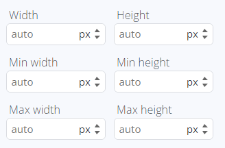
Height determines the height of the selected element. Similar to width, minimum and maximum height values can be established, ensuring the element stays within specified height boundaries. Normally, elements have an "auto" height, making their height responsive to the content.
Containers and cells typically have a default height of 75 pixels.
Just like with width, pixels or percents can be used as measurement units for height.
For Letter format, 100% height equates to 1036 pixels, while for A4 format, it corresponds to 1103 pixels. These variations should be taken into account during template development.
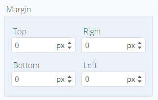
Margins: Margins are employed to create space around elements, separating them from one another and extending beyond defined borders. Margins can be set using absolute values (like pixels) or relative values (like percentages). When specified in percentages, the value is calculated based on the height of the parent container for margin-top and margin-bottom or the width of the parent container for margin-left and margin-right.
Paddings: Paddings are used to generate space around an element's content, residing within any defined borders. Like margins, paddings can be configured with absolute values (e.g., pixels) or relative values (e.g., percentages). When expressed as percentages, the calculation considers the element's height for padding-top and padding-bottom or the element's width for padding-left and padding-right.
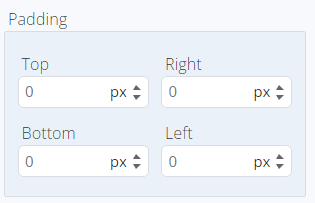
Padding for the parent element and margin for the child element may appear in the same space visually, but these values are distinct and can be applied concurrently.
Let's see how the