How to set up a Color Theme:
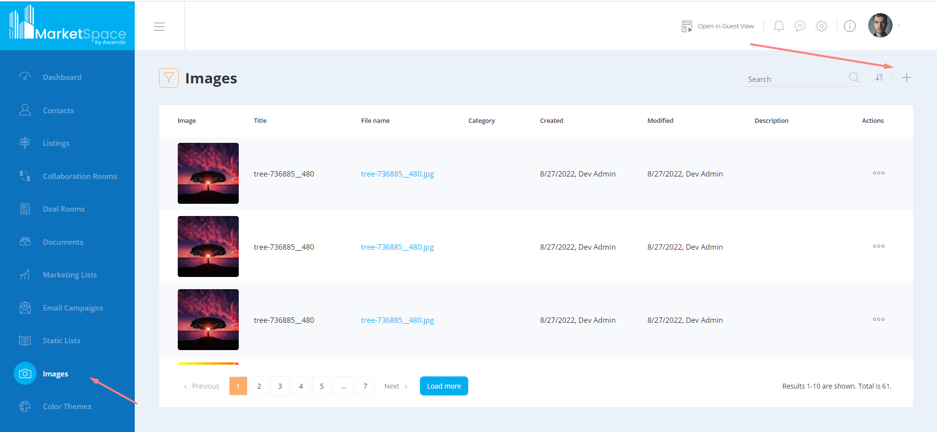
1. Open the Images tab and upload the images that should be used as logos (it is necessary to upload the logo(-s) beforehand, so they will be available in the color theme settings).
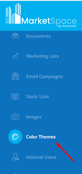
2. Open the Color Theme tab in the main menu.
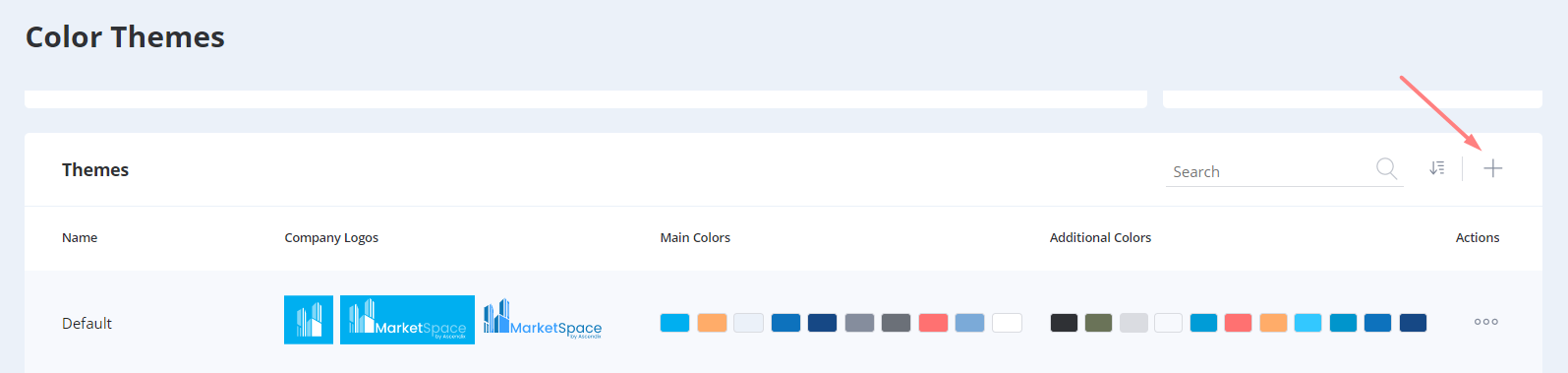
3. Scroll down to the “Theme” sub-tab and press the “+“ button in the upper right corner.
4. In the opened window, enter the values to create the color theme.
The “Name” of the theme is the only required field, all other fields are optional. By default, MarketSpace’s colors are substituted for the theme as an example and can be adjusted manually.
5. The values that should be mentioned include:
- Company Logos: small logo (80x80 px), big logo (220x80 px), anonymous logo (220x80 px). They are selected from the previously uploaded images in the Images tab (described in p. #1 of this tutorial).
- Main colors: primary, secondary, and background colors, menu color 1, menu color 2, main menu font color, main menu hover font color, icons color, font color 1, error color.
Additional colors can be added to the theme as well. There are 2 options to assign the additional colors:
- activate a toggle and generate them automatically based on the entered main colors;
- add custom additional colors.
In the case of the automatic additional color generation, there is no option to customize them manually. On the opposite flow, manual customization is available.
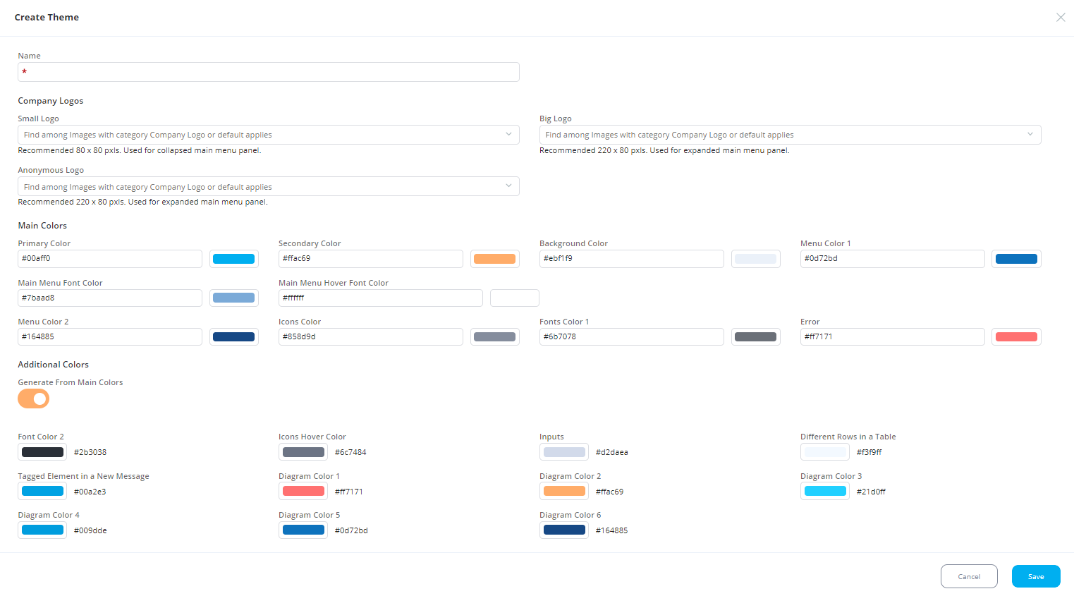
6. To set the color, it is necessary to know and enter its HEX code.
7. Once all the settings are finalized, press Save. The newly created theme will be displayed below the last added theme (below the Main theme initially).
8. The Theme can be customized if it is unapplied yet. In case, the theme is applied to the interface, it is necessary to assign any other theme to activate the editing of the current theme.
9. In the unassigned mode, the theme can be edited, applied, copied, previewed, and deleted. In the assigned mode, it can be copied only.
The color setting will be applied to the following elements:
- Primary color:
- buttons;
- breadcrumbs;
- links. - Secondary color:
- colors of checked checkboxes;
- booleans;
- active (selected) buttons in menus. - Background color:
- colors of borders;
- separators in menus;
- background of disabled inputs. - Menu color 1:
- the color of the progress bar;
- main menu background. - Main Menu Font Color:
- text color in the main menu. - Main Menu Hover Font Color:
- the color of active and hover text in the main menu. - Menu color 2: out of use
- Icons color:
- text color in the tooltip;
- text color in accepted terms and conditions;
- the color of secondary buttons and cancel buttons in dialogs;
- the color of icons in menus;
- the background of inactive breadcrumbs items;
- text color on some disabled buttons;
- period selection icon on dashboards. - Font color 1:
- text color in some titles;
- lookup and picklist dropdowns;
- text color in the filter panel;
- border color around the main content;
- text color somewhere in the conversion panel;
- delete the icon color in the tag list. - Error:
- the color of validation errors, operation errors, etc. (for example, exceeding the allowed text length in chats for sending a message, an error when uploading files in the file upload dialog). - Font color 2:
- placeholder color on “access by link” input;
- text color in breadcrumbs for email campaigns;
- management notifications title text color;
- accept NDA checkbox color;
- data picker footer text color on hover. - Icons hover color:
- the color of borders in the undisabled color picker;
- the color of the dropdown border of lookups and picklists;
- the color of borders of text inputs in focus;
- borders in the filter panel. - Inputs:
- borders of inputs;
- sliders;
- checkboxes;
- the color of connecting lines in the folder tree;
- borders in tag lists. - Different rows in table:
- the color of the warning icon in chats;
- background color of even lines in tables;
- background color of own messages;
- hover color in pagination. - Tagged Element in a New Message:
- button color on hover. - Diagram Color 1:
- color in dashboards. - Diagram Color 2:
- color in dashboards. - Diagram Color 3:
- color in dashboards. - Diagram Color 4:
- color in dashboards;
- hover the color in the control link. - Diagram Color 5:
- color in dashboards. - Diagram Color 6:
- color in dashboards.