Composer Online editor consists of the header, left and right sidebars, and the working area.
By default, the editor area is an empty white section. The elements should be dragged here and positioned based on the report design.
Navigation bar

- The navbar contains a clickable branding logo that serves as a link to the main page.
- The title has a symbol limit of 260. A new value can be saved by pressing Enter or clicking outside the title field.
- The icon below title indicates the template type (Printable, Email, or Microsite/HTML).
- The "Generate" button allows for generating a preview and publication after selecting the desired records.
- To toggle the visibility of element borders, use the "Borders" button.
- To switch to the full-screen mode, select the “Full-screen mode” button.
- The “Zoom” button facilitates zooming in and out of the template.
- The “Gear” icon opens the Template settings, which consist of two tabs: General and Format settings.
In the General settings, the template's name can be edited. The Main entity, selected during template creation, is also identified here. The Main entity cannot be changed once the template is created. The Description field is a text area visible only in Composer Online and does not affect the resulting report.
The Format settings allow for configuring the template's orientation (Portrait or Landscape) and page size. Additionally, margins can be adjusted at the template level, affecting every page of the template and future reports.
Left Sidebar
The left sidebar is divided into two tabs: Add Content and Structure.
Add Content
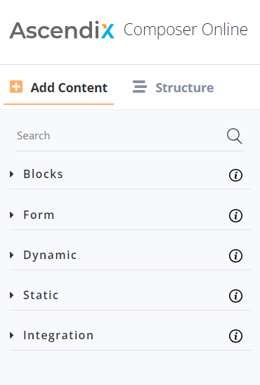
The Add Content tab is responsible for populating the template with content and includes the Dynamic and Static Elements tabs. It also features optional tabs such as:
- Blocks (pre-designed template components)
- Integration (elements for configuring connections between CO and other applications)
- Form (used for creating forms on CO-generated microsites). The search bar allows for element search by name.
Structure
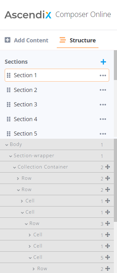
The Structure tab displays a list of sections created within the template. A section represents a chapter in the template, whose length can vary depending on the content and may span from one to multiple pages.
Sections can be added using the "+" button and can be reordered by dragging and dropping. It is possible to duplicate and delete sections, with the exception that the last section cannot be removed.
Additionally, there are separate sections for the Header and Footer.
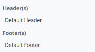
These elements are managed independently from the template sections. The top area of the section is used for setting up the header, while the bottom area is designated for the footer. Elements must be placed in these specific areas to be visible in the resulting report's header or footer. Otherwise, the elements will reject adding.
The template structure is presented below the header and footer tabs. The Body and Section-wrapper are technical components that are automatically inserted and should not be modified.
Elements in the editor area are displayed hierarchically based on their placement. When selecting an element in the structure, it will be highlighted in the editor area and vice versa.
The elements marked with this symbol are draggable and can be repositioned within the hierarchy. Any changes made to an element's position in the editor will be reflected in the Structure tab.
The left sidebar can be resized and expanded up to 50% of the screen.
The structure part (elements hierarchy) of the Structure tab can be resized vertically in a custom size.
Right Sidebar
Style
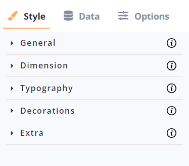
The Style tab is responsible for managing the styling of elements and the overall template. It consists of five sub-tabs:
- General: Controls the directions and alignments of elements.
- Dimension: Manages parameters such as width, height, margins, and paddings of elements.
- Typography: Deals with text parameters, including fonts, text alignments, letter spacing, and more.
- Decorations: Adjusts elements' borders, colors, and backgrounds.
- Extra: Provides more technical settings, including controls for CSS properties.
Data
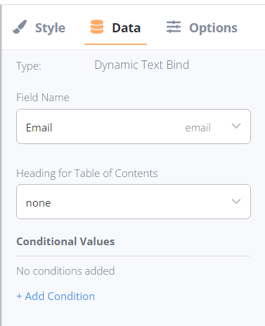
The Data tab handles data binding, which involves specifying the required fields in the data source from which Composer Online should extract values. Filters and conditions for data retrieval can also be set here.
Options
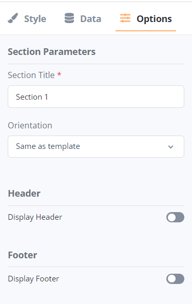
The Options tab displays the Section settings. It allows for renaming sections and setting custom orientations for specific sections. There are 3 options available:
- Same as template: The section's orientation will be updated according to the global template orientation.
- Portrait: The section will maintain a portrait orientation, even if the template's orientation is different.
- Landscape: The section will maintain a landscape orientation, even if the template's orientation is different.
Header and Footer options can be individually activated for each section using the corresponding toggles.